Something a little different from a standard website design, this retail demo had to be bold and eye-catching, yet simple and engaging.
Weber In-Store Demo
For this project:
Skills
- UI Design
- UI Animation
- UX Design
Tools
- Adobe XD
- Photoshop
- After Effects
- Illustrator
The brief
A lot of BBQ products are relatively self-explanatory, but with the new iGrill range that makes use of modern technology, Weber wanted to put a helpful demo in stores to help explain to customers how easy they are to use and which one is right for them.
At its core, the iGrill is a digital thermometer that links up to an app on your phone to help cook BBQ food to perfection.

The process
This project was a collaborative team effort. My role was to design the UI, and help map out the user flow through the demo, including storyboarding the attract loop that would get the attention of users walking by. Working with me on the project, was a motion designer, video editor, and creative lead who helped ensure everything came together.
Research
We started out by exploring the current Weber brand. We had access to some printed materials (that would be on display with the products) as well as the company website. We gathered together elements that we felt could be used within our demo such as:
- Colours
- Patterns
- Typography
- Videos
- Images & Icons


Naturally, Weber had a whole bunch of fantastic lifestyle photographs and videos that we used to help tell the story.


Attract loop
The first section of the demo that we worked on, was the attract loop. The purpose of the attract loop was to play after the demo had been inactive for a period of time. The attract loop would then loop through some key features of the products with several calls to actions trying to persuade passing customers to interact with the demo.
UI Design
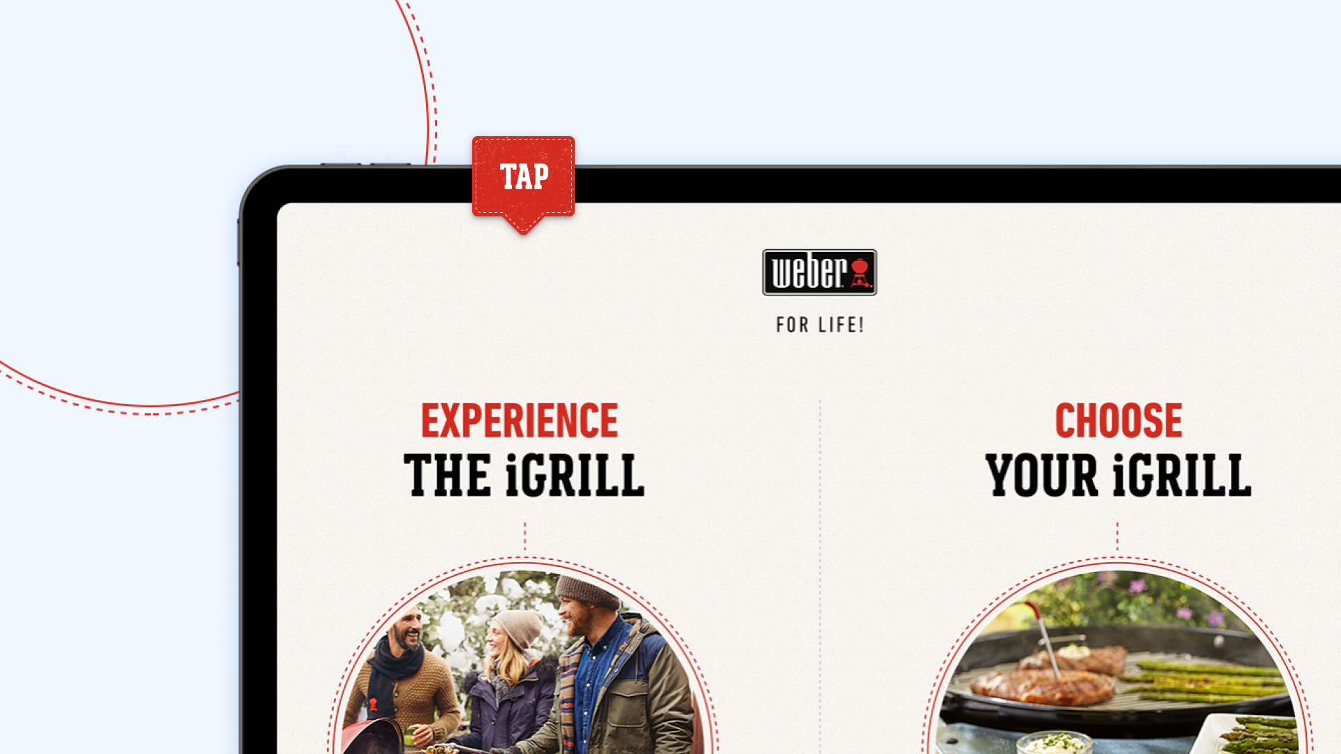
Initially, the design had 3 sections for the users to choose from; “Experience”, “Watch” and “Choose”. We played with a few different typography options but ended up sticking with the slab serif fonts with as this was easier to read from a distance.


The “Experience” section, we combined screen recordings of the app with videos that we used to highlight what’d be happen in real life.


The product selector was a great screen that allowed customers to interact with the demo as if they were explaining to a consultant what their needs are. It allowed the customer to refine the products based on their BBQ habits and current equipment.
After selecting a combination of statements, we used opacity to filter out products, leaving the suggested product(s) :


To help explain what we intended to build, and also test our designs on the screen it was being displayed on, we built up a prototype. This helped up to identify whether the user flow was simple enough and also whether our ‘tap’ areas were big enough.
View PrototypeThe solution
The final product was rolled out to all the top stores their products are found within the UK. I loved seeing my work out there in the wild!
The demo accurately captured the rustic, traditional BBQ feel that Weber has established in their brand. The use of the background patterns and the slab-serif font really helps with this.
Summary
This project was certainly something different than what I’m used to. It was interesting having to consider the environment beyond the screen; busy shops meant that sound would have been weak and potentially annoying. It also had to compete with the visual noise around it from other products, so the design had to work harder to grab the attention of customers passing by without looking too crazy.