Academy Point is an LMS (Learning Management System) for enterprise businesses to train their staff. My work covered designs for both the company itself, the product, and the clients customisation.
Academy Point Branding, Website & Product Design
Overview
My design responsibilities at Academy Point varied greatly; from product design to branding and marking, both internal and client-based. When I joined the company back in June 2018, there were only the remnants of multiple outsourced designers – Academy Point had never had a designer. It was my job to pull it all together to create a more coherent voice and introduce consistency.
In this (rather large) case study, I cover the branding of Academy Point and the evolution of product itself.
The Academy Point website can be viewed at academypoint.net.
Branding
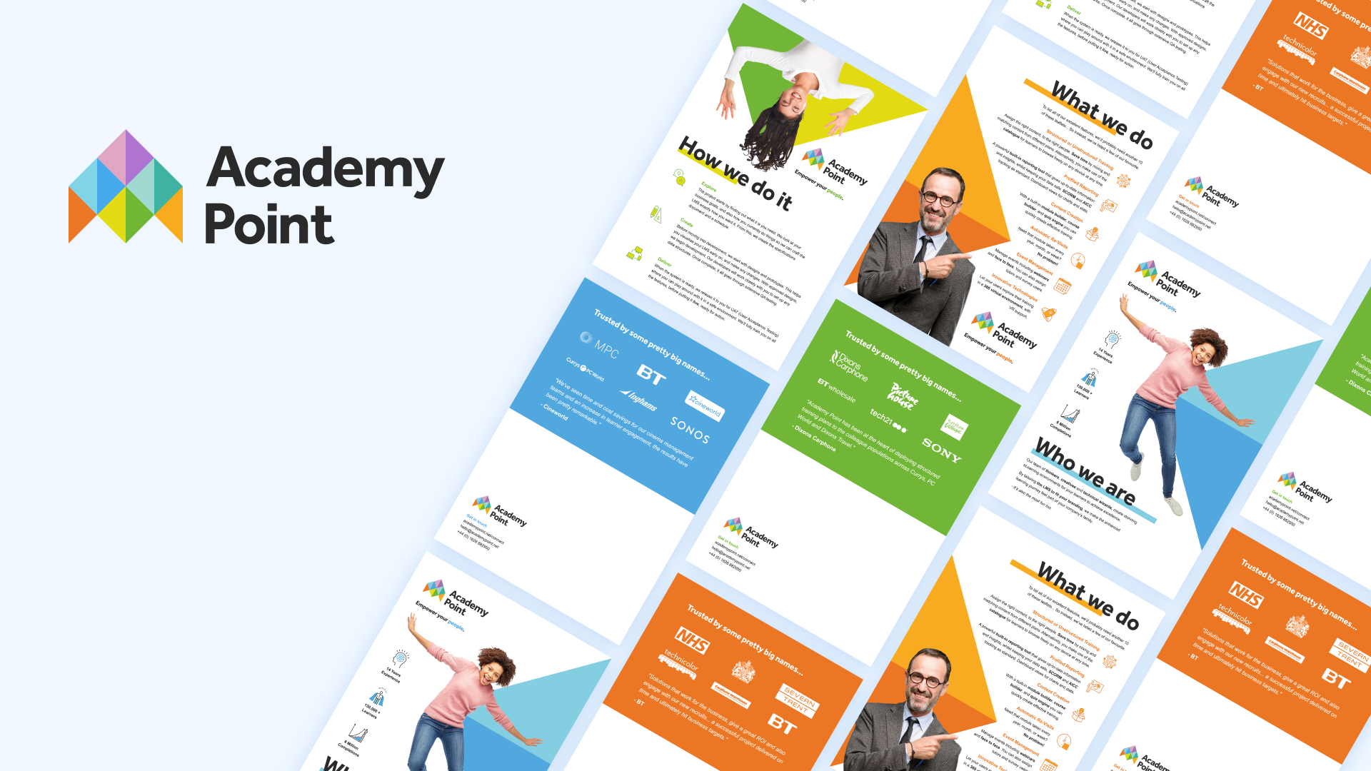
Back in 2018, when I joined the team at Academy Point, one of the first tasks that I tackled was tidying up the company’s branding. The logo had just recently been updated and a few assets had been created by various freelancers. Because of this, there were some inconsistencies that I wanted to tidy up.
It was important that I didn’t stray too far from the newly established brand, as I didn’t want to confuse the customers or the Academy Point team.
Logo & colours
I had noticed a few things with the logo that I wanted to improve:
- Colours – I wanted to pull them tighter together so they looked more consistent with each other. Checking them in grayscale helped massively with getting similar tonal values across the board.
- Lockup – I adjusted the lockup to help the text sit nicer and inline with elements from the brand mark itself. This helps to make it more legible at smaller sizes.
The difficulty with having a logo that contains multiple colours, is deciding which colour to use primarily – things like buttons should be consistent across websites to help users identify them easier.
I ended up deciding to use the off-black text colour from the logo. This proved helpful for multiple reasons:
- It was less intrusive on clients branding when evaluating the product. On areas of the system that can’t be themed, it didn’t look strange when put next to the clients branding.
- It made the other colours more vibrant when used in graphics.
- It settled internal debates over what the colours should mean, and what they should be used for.

Imagery & tone of voice
To help complete the brand, I introduced some images and messaging for our company to use. Unlike our competitors, I wanted to stand out and make the product be more about the people that use it, rather than a series of dashboard screens and graphs. I used images of ordinary people who are either connected (seen using a device that can run the LMS) or celebrating success.


Marketing collateral
Along with the tidy up, I produced new business cards, leaflets, Microsoft Office templates (including PowerPoint and Word) to be used by our team in networking events and both internal and client-facing documents.


Website
My most recent work for Academy Point is the new website. Previously we were using a very clunky WordPress theme that was hard to maintain. All the buttons were inconstant, the images were of low quality, and it was just filled with walls of text.
As a v1 of the new website, the goals were simple:
- Explain who we are
- Describe the features of our product
- Encourage customers to request a demo
It had to be easy for us to maintain, have good performance, and be recognisable as Academy Point through our newly developed branding.
I started the project with some mood-boarding. Finding out what our team liked the look of, what they thought was effective, and identify things we wanted to avoid. From this, I was able to create some wireframes, getting all the important sections of the site laid out.

After a few rounds of amends, I started working on some common components – these formed the base of our new design system (more on this later)!


I iterated through several layouts to achieve a clean look that didn’t overwhelm the visitor, but at the same time, looked interesting. This iteration also involved several different imagery ideas, as well as discussions around colours.

The hardest part with the colours was ultimately down to accessibility. The main brand colours for Academy Point are not accessible on white / with white text. It was also impossible to choose just one colour that we felt should represent the brand when they all have equal weight for the brand.


Animations were added to the website to help give it smoother experience. Sadly, the ‘Blended Learning’ animation didn’t quite make it in the first version due to its complexity.
(GSAP’s SVG morph library would have done the trick but it seemed a little excessive to purchase a whole animation library just for 1 animation!)


Product design
In addition to the branding and marketing role at Academy Point, I also had to create the designs for the product itself – our LMS (Learning Management System). There were 3 main areas for this:
- The Admin Area – This is where our clients would manage their system.
- The ‘Academy’ – This is what we dubbed the name for the part of the system that end-users would view. Each client’s version of the Academy looked slightly different, you can see an example on my Cineworld case study.
- The Design System(s) – This would help me be consistent, and turn around designs much quicker.
The Admin Area
Academy Point’s current admin area had been built using limited designs from an outsourced designer which meant that there were a few inconsistencies, misunderstandings, and it was developed without any creative review. The designs that had been created for it were in Photoshop, and so there was no form of design system or re-usable components for me to use.
I first set about creating a rudimentary set of reusable components so I could continue to design areas of the admin whilst I worked on an updated design.


With this designed, I was able to quickly mock up any designs for new features whilst I was also working on the newer, more consistent design. This allowed the team to continue pushing out updates to the systems.

I then moved onto updating tweaking the overall design. Making things like the typography and buttons more consistent, making better use of the layout and providing more helpful information to the admins when they need it.
One thing I had to be careful of, however, was not to change the layout too much from the current system as this would create a huge overhead on the development side of things.
The first area to adopt this new design was events. Below you can see that with the new designs, I also created additional states for each element to help the developers.


In hindsight, events were probably not the best place to start rolling out the new design. The concept of events is very complex, and because of this, the whole process was far more complicated and drawn out than it needed to be.
As a heads up, things to consider when designing a system around events are:
- Timezones – Admins can be in many different states of time compared to the users that will be attending the events!
- Reusability – Due to the nature of our LMS, it’s quite likely that our admins want to reuse the details from an event. We tackled this by having an Event > Session structure, where the admin could simply add a new session date to the event and it’ll reuse all the details from the event. This added a lot of unnecessary complexity in the end, and on reflection, I’d opt for a ‘duplicate’ event functionality instead.
- Past, present, near future, distant future – We had to come up with ways to handle scenarios like “what happens if an event session date is moved from the past to the future?”
- Event communication – We send notifications and emails to attendees, event tutors and event managers. We had to make firm decisions on what happens when attendee’s status is manually transitioned, for example, from ‘attended’ to ‘cancelled’.

With the consistency updates being rolled out to the rest of the admin area now, the next step is how we can bring the admin in line with the future of Academy Point. The current admin area doesn’t reflect our brand very well, and it requires a completely separate set of components from our website (which increases developer work as well as design confusion). Therefore we’re now planning the next admin area which will radically simplify everything, making decisions far easier for the admins, and pulling forward more important information and everyday actions.
Summary
Without other designers to liaise and discuss ideas with, it’s been difficult at times. I’ve had to spend more time on things than I would have liked to explore ideas in more detail, just to prove to myself that it is or isn’t the right one.
I believe I’ve provided Academy Point with much more structure and process around design. Previously, the developers would have to create quite complex systems on very limited designs. I now make sure they receive various designs at different breakpoints and contain as many different states that I can think of. Occasionally, I’ll even dive into HTML, CSS and JS to help articulate a particular layout, interaction or any other idea where static designs don’t cut it.
The new academy designs and improvements in the admin area have been well received by our clients. They enjoy the more efficient layouts, creative ideas, and quicker turn-around times for design proofs.
The Academy Point team also enjoy having a design system they can rely on to answer questions, and also pre-made templates to make documents look great for clients.