As an existing customer of Academy Point, Cineworld’s online learning platform was updated to the Academy Point's very latest LMS (Learning Management System). This update came with an overhaul of their UI to improve user experience and make it mobile friendly.
Cineworld LMS Design
For this project:
Skills
- UI Design
- UX Design
- UI Animation
- Photo Editing
- HTML + CSS
- Specification Writing
Tools
- Sketch
- Invision
- Flinto
- Photoshop
- Illustrator
- CodePen
- VS Code
The brief
The previous system wasn’t mobile-friendly, lacked a few accessibility features, and was beginning to look a little dated.
The system upgrade meant that Cineworld was going to be one of the first clients to be built on top of our newly created ‘Core’ system.
One final consideration was that Cineworld uses the same LMS for one of their sister companies, Picturehouse. Because of this, whatever I designed had to be themed for the Picturehouse branding too.
The process
Cineworld was being built on top of our core LMS and so I had to adhere to the layout and data that was already being used. I started with a few design explorations to make sure the client was happy with the branding direction as well as the general look and feel of the new system.


I explored a few ways we could potentially make the login screen ‘come alive’, but later decided that this was a little too much and would probably not run very well on the computers found in the cinemas.
By establishing a good understanding of the client’s branding and expectations early on, this helped me to start building up a basic design system for the project which helped me quickly re-skin the rest of the standard pages in LMS.

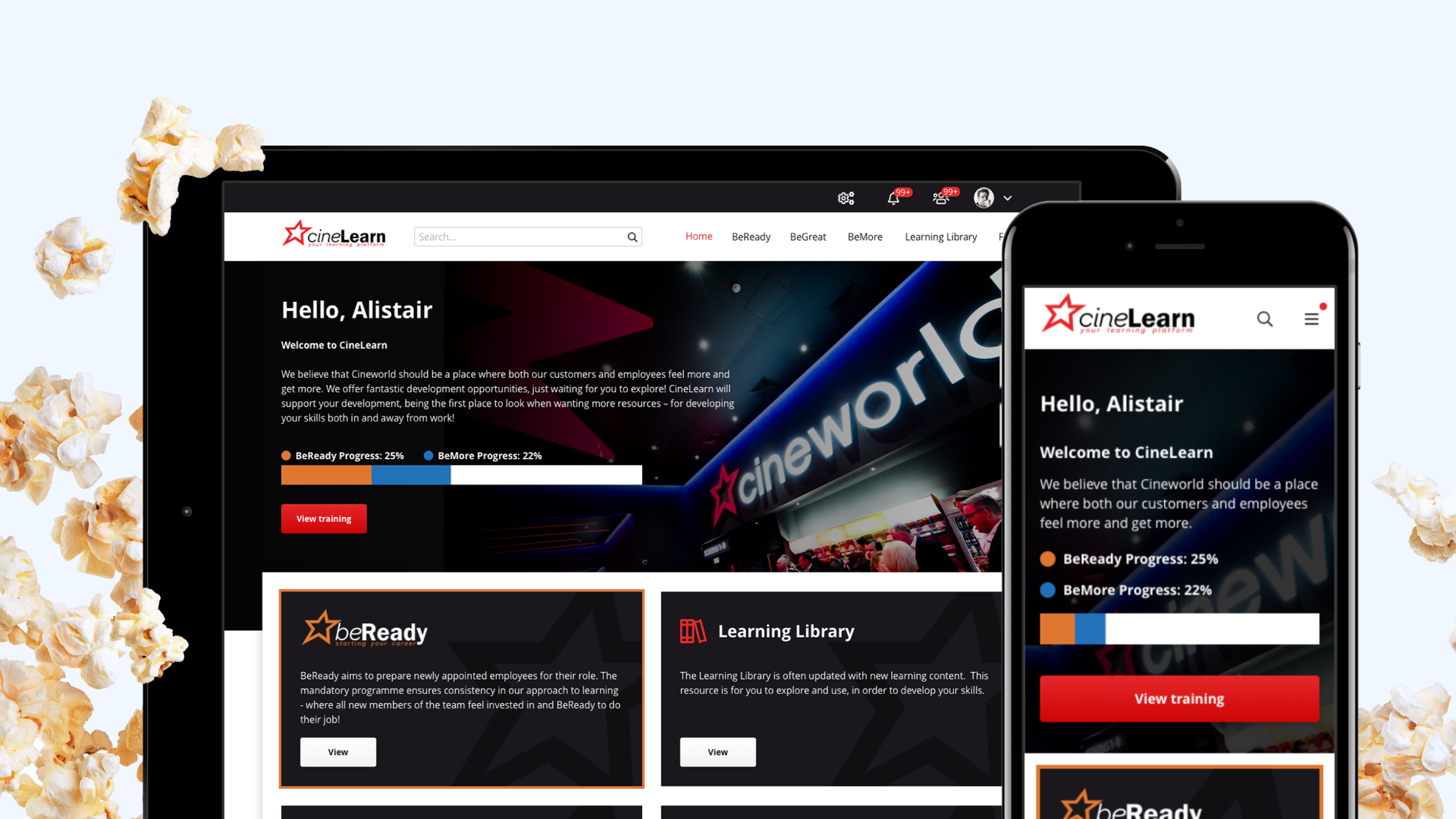
Mobile designs were produced for all pages as well.


The events page included a callout to the ‘Learning of the Month’ as well as quick access to upcoming events that the learner is booked on.

The dashboard page was often very different for each client as they focus on different KPI’s.

There were a couple of areas that really made this LMS feel different from other’s we had done. These included an onboarding screen, custom loading indicators, and a fun error page.


The loader was an animated SVG so the colour could be easily changed when needed via css.
The final hurdle was making the system easy to change theme depending on who was logged in – a Cineworld employee or a Picturehouse employee. To make this a little easier, I set a few basic rules with colours, typography, images, and icons.
- The site was predominantly greyscale but used each company’s primary brand colour.
- All icons and the plan titles were made to be the same size, making it easier to swap out without affecting any layout (particularly across screen sizes).
- Images were often set as background images, so these could easily be swapped out with just CSS.


Keeping these changes simple and predictable, helped keep timings down not only for the design stage, but for development and testing.
Like all Academy Point projects, I was the only designer on this project and was working alone with the client throughout. To ensure I stayed on track, I would check in with the rest of the team to show them my ideas, and validate the development effort involved – occasionally creating the odd CodePen demo to help explain my ideas.
The solution
During the early stages of the designs, a prototype was made to assist the client in a presentation at a company-wide event. When meeting with the key stakeholders afterwards, they all reported how excited everyone was to see the new LMS.
The designs themselves and the HTML kit was completed far quicker than any previous project due to working with the newly created Core templates.


The final product is now far quicker than the previous system (the cinemas restrict bandwidth to prioritise the sales terminals and the previous LMS was slow due to heavy reliance on third-party JavaScript libraries and over-sized images). It is now also mobile-friendly, meaning that cinema colleagues can complete essential training wherever, whenever.
Newly thought-out user journeys has resulted in fewer help-desk cases with people getting locked out of the system, struggling to complete training, or making mistakes in general.

Both the Cineworld and Picturehouse designs now have a basic design system which will allow me to quickly create new areas of the site in the future. The file contains components for buttons, content tiles, form inputs, colours, typography styles and more.

Summary
Systems this size can often be daunting to tackle – especially on your own.
However, by sticking to previously created layouts, following brand guidelines carefully, and getting the development team involved early to ensure the handover went smoothly, this project went from start to finish without any serious setbacks.
My favourite part of this project was working on some of the more exciting animations – dipping my toes into SVG animation and loading up Flinto to explore screen transitions.