From nothing but a name, to a complete website and brand – this project was about giving Jonnora a face for their newly establish business, and a place for their tenants to get important documents or report a repair.
Jonnora Website & Branding
For this project:
Skills
- Branding
- Logo Design
- UI Design
- Website Design
Tools
- Photoshop
- Illustrator
- InDesign
The brief
Jonnora is a private landlord business that has several properties rented out to tenants. There were three distinct goals for this project:
- To allow tenants to easily access a system where they could report any issues with their property that needed repairs.
- To advertise any available properties.
- To host important documents for new tenants to easily access to download and complete.
Jonnora had just converted from an individual to a limited company with a the new name, and as such, also need a completely new logo and brand.
The process
Apart from the website build itself, the project was left completely up to me. I was the designer and the product owner. I started out with a meeting to understand the history of the business so I could weave it into the branding.
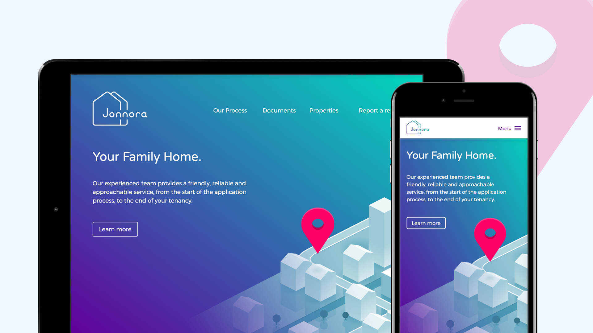
The name, Jonnora, is a combination of the original founders “Jon and Nora”. I wanted this idea of the couple weaved into the logo. With some very rough sketches, I quickly came to the idea of having two homes, emphasising on the double ‘n’ within the name.
As the company was relatively newly formed, the branding wanted to be modern to reflect this. By use of geometric shapes and evenly rounded line endings, the logotype was actually custom-made to be clean, simple, and friendly to reflect the nature of the business.
I opted for a bold and vibrant colour palette for the website, some-what futuristic to match the illustrations. This was to reflect the idea of looking into the future, as tenants would be when looking for a home.
Subtle animations were added to the site to make it feel less static. These also helped the site feel more modern.
To accompany the website, common marketing collateral was created for the client to use. Business cards, letter templates, and tenancy application forms were all created using the newly created brand.


The solution
The end result was an easy to navigate, single-page website that the client could easily add new properties to, and the tenants to very quickly access important resources as well as report any repairs needed.


The website was mobile-friendly as not all the tenants had desktop computers so would likely access the site on phones or tablets.


For the letterheads, I actually created 3 versions for the client; a black and white version that was suitable for cheap photocopying, a simple flat-coloured version that suited cheap colour printers, and then a higher quality gradient version for when a professional printer was available.

Summary
The client absolutely loved the colour palette and gradient used. The logo was simple yet recognisable and the graphics helped give boring documents a bit of personality.
For a small project on a tight budget, I was happy with how this turned out and I think it’s given Jonnora a professional face for the business.
Jonnora’s website can be viewed here.