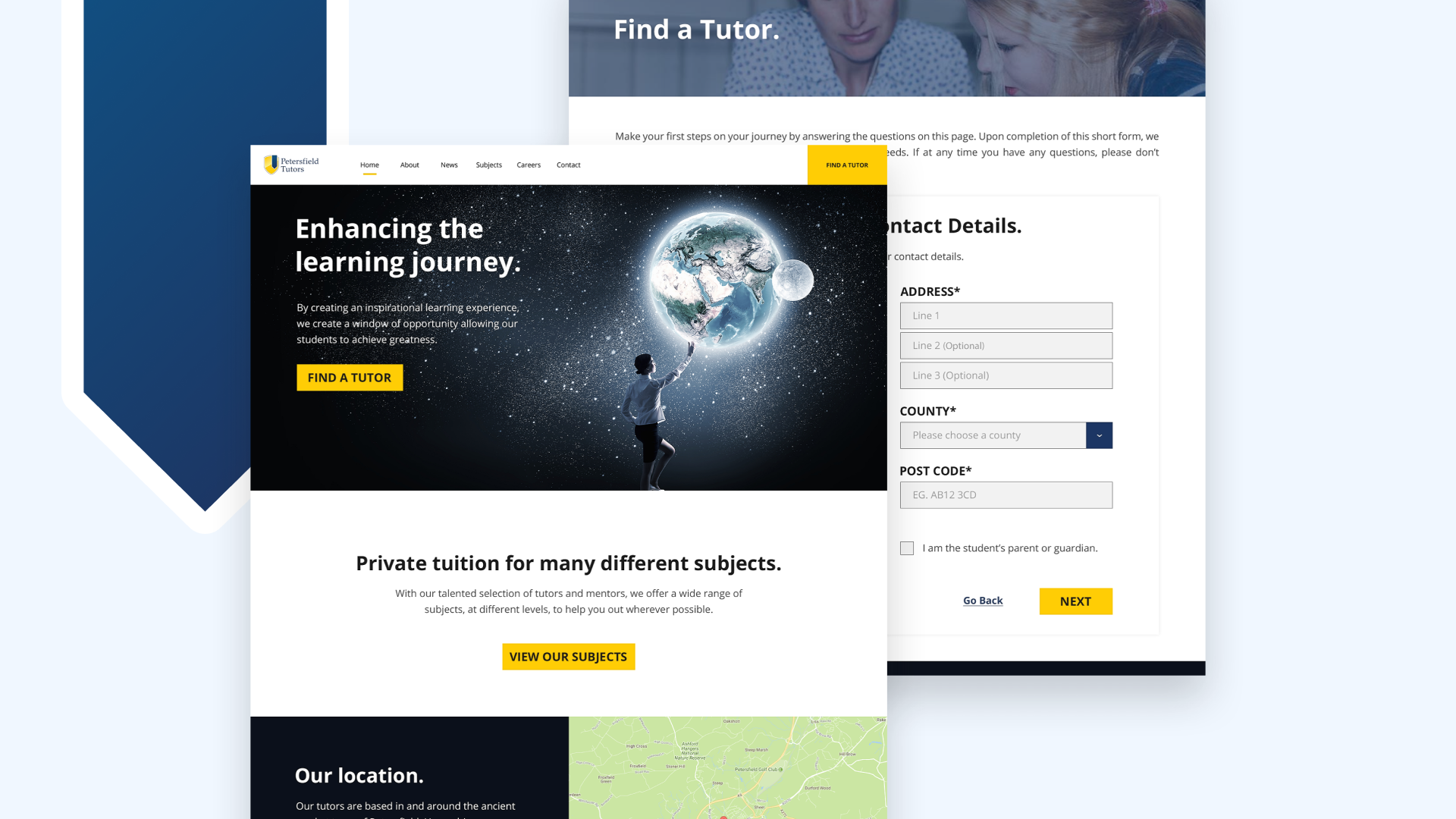
Just starting out, Petersfield Tutors needed a brand identity. A logo, colour scheme, imagery and website was all made from scratch, giving the client the professional touch they needed to launch their business.
Petersfield Tutors Website & Branding

For this project:
Skills
- Branding
- Logo Design
- UI Design
Tools
- Adobe XD
- Illustrator
- Photoshop
The brief
Petersfield Tutors approached me to help them establish a brand, create a website, and define their voice.
The client offers private tuition services for a range of subjects and ages. The target audience was primarily affluent parents who wanted to give their child extra help in particular subjects to improve their grades at school. Therefore, the brand needed to be professional, and in line with a traditional education tone. That being said, Petersfield Tutors didn’t want to come across as old fashion, and so there had to be a modern touch to it.
The process
Before building the website, I set out to create their brand. A logo, typography, some key colours, and a tone of voice.
Colours
I started by researching some colours and ended up with a blue and a yellow. I chose a blue to resemble trust and friendship (a reference to most social networks). I chose a yellow to resemble intelligence, education and knowledge (similar to logos like National Geographic, and IMDB, for example).

Logo
Within the logo, I used a shield – this was a nod to common school crests found on uniforms. I paired the logo mark with a serif logotype, as I wanted to reflect the text from a good book.
Typography
To complement the serif typeface used in the logo, I picked a modern sans-serif typeface, Open Sans, to use within their marketing material as well as their website.

Website
Their website had 3 main goals:
- To allow potential customers to get in touch and find a tutor.
- To allow potential tutors to get in touch and offer their services.
- To allow Petersfield Tutors to share information, news and other updates around their business.
I initially proposed 2 ideas that we could go down for the website design. The first idea was a quirky illustration/doodle based design that presented a more friendly, playful image.
This idea was discarded though, as it didn’t quite match the crisp, professional image the client wanted to achieve. The second option had a much more ‘premium’ feel to it

As I continued the design process, particularly working on the mobile design, this was moulded into a design that was developer-friendly (I outsourced the development on this project, and didn’t want the project costs getting out of hand with a complex design), responsive, and adaptable (the site was built in WordPress, so I had to ensure that as the client added their own content, everything would work).
There’s a lot of data that needs to be captured during the ‘Find a tutor’ process – this was broken down into stages to not overwhelm the user.

The solution
With all of this put together, the brand was complete. Petersfield tutors had a logo that their clients could recognise them by, colours that had meaning, and a website that was very easy to use.
The website was built in WordPress which allows the client to frequently post news and update any information. It’s fully responsive which allows parents or students to easily make contact with the client to start their “Enhanced learning journey” – this was the tagline we used which really emphasised exactly what Petersfield Tutors does.
The website is live and can be viewed at petersfieldtutors.co.uk.

Summary
Every week there are new students requesting a tutor, it’s one of Petersfield Tutors key customer acquisition channels. With the careers page, they’ve also grown their team to cover even more subjects and increase availability for the new students.
Since going live with the website, we’ve also added a “Staff Room” forum where tutors can hang out and share information with each other. This was easily made to look part of the Petersfield Tutors family by applying the brand.


